Tutorial
In this tutorial, we'll cover the entire process of developing an application. We'll integrate three widgets and configure each uniquely, leveraging the extensive options available through the widget API. No prior knowledge of any frameworks is assumed. The techniques you will learn in the tutorial are fundamental to building any application with our widgets, and it will equip you with a comprehensive understanding of our library's broad capabilities.
If you encounter any problems during the tutorial, or if you prefer to skip some of the preliminary steps, feel free to copy code from the provided examples.
What are you building
In this tutorial, we'll create an application focused on visualizing market data,
featuring components such as WatchList, SimpleChart and TimeAndSales.
You can see what the final result will look like here:
Setup environment
To create the application, we set up the environment. This guide uses Vite, but any build system can achieve similar results. Let's start by creating our project:
$ npm create vite@latest widgets-app -- --template vanilla
$ cd widgets-app
$ npm install
$ npm run dev
Now we can see our app, generated by Vite, by opening localhost on 5173 port.

Let's clean it up a bit before building the app. Here's what we need to do:
- Open
style.cssand clear its contents - Open
main.jsand clear its contents - Remove
counter.jsandjavascript.svg
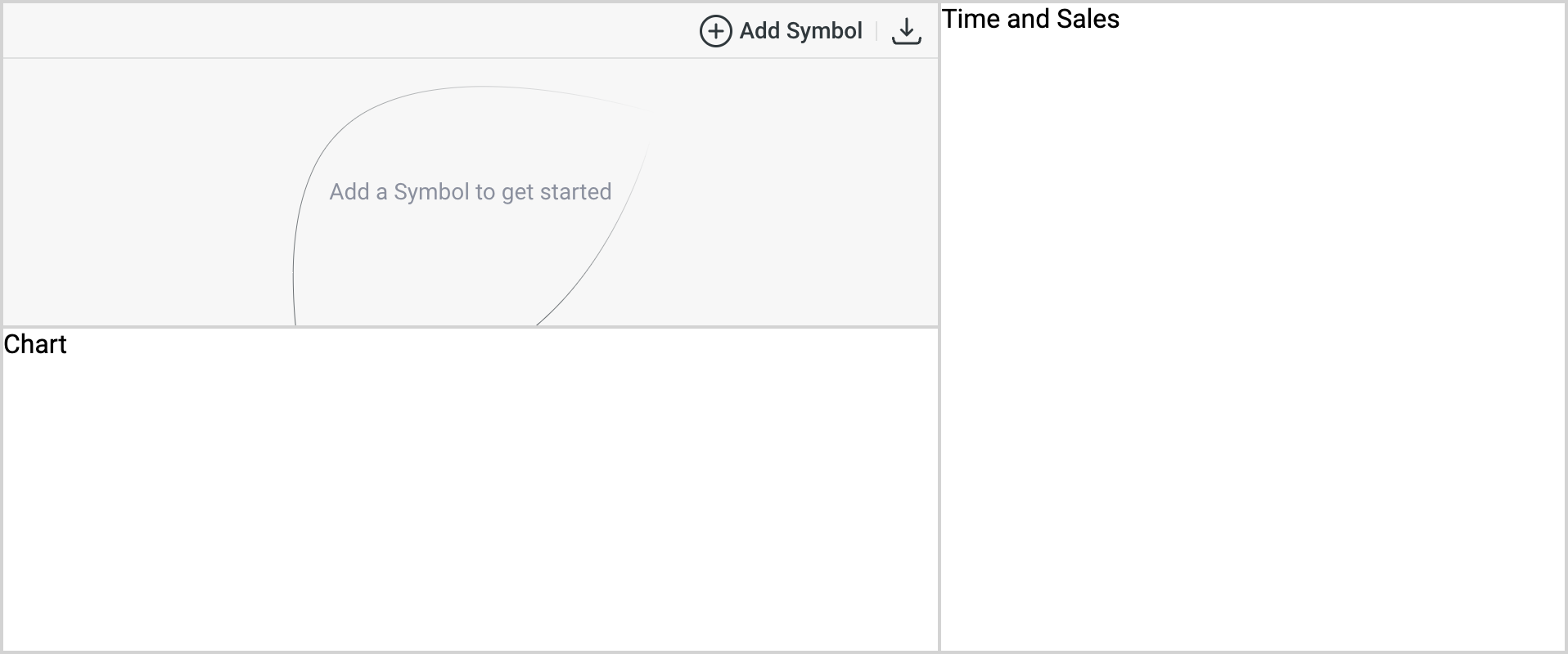
After doing so, we should see a white, empty page. This is exactly what's needed.
Layout
Let's outline the basic layout for our widgets, so we can add them later. First, we need to modify our index.html file:
<!DOCTYPE html>
<html lang="en">
  <head>
    <meta charset="UTF-8" />
    <link rel="icon" type="image/svg+xml" href="/vite.svg" />
    <meta name="viewport" content="width=device-width, initial-scale=1.0" />
    <link rel="stylesheet" href="/style.css" />
    <link
      rel="stylesheet"
      href="https://fonts.googleapis.com/css?family=Inter:400,500,600,700&display=swap"
    />
    <script type="module" defer src="/main.js"></script>
    <title>Widgets App</title>
  </head>
  <body>
    <div id="app">
      <section id="watch-list">WatchList</section>
      <section id="time-and-sales">Time and Sales</section>
      <section id="simple-chart">Chart</section>
    </div>
  </body>
</html>
Now, we need to introduce some layout styles to correctly position our widgets. Let's add the following styles in style.css:
html {
  font-family: Inter, sans-serif;
}

body {
  margin: 0;
}

#app {
  display: grid;
  grid-template-columns: minmax(0, 3fr) minmax(0, 2fr);
  grid-template-rows: repeat(2, minmax(0, 1fr));
  gap: 2px;
  background: lightgray;
  box-sizing: border-box;
  height: 100vh;
  padding: 2px;
}

#watch-list,
#time-and-sales,
#simple-chart {
  background: #fff;
  overflow: hidden;
}

#time-and-sales {
  grid-column: 2 / 3;
  grid-row: 1 / 3;
}
As a result, we get the following layout:

Configuring npm client
Before installing widgets in our demo app, we need to configure npm to work with our private repository.
To achieve this, we must create a .npmrc file in the project root with the following content:
@dx-display:registry=https://dxfeed.jfrog.io/artifactory/api/npm/npm/
@dxfeed:registry=https://dxfeed.jfrog.io/artifactory/api/npm/npm/
//dxfeed.jfrog.io/artifactory/api/npm/npm/:_auth=[YOUR-ACCESS-TOKEN-HERE]
//dxfeed.jfrog.io/artifactory/api/npm/npm/:always-auth=true
Don't forget to replace [YOUR-ACCESS-TOKEN-HERE] with your token in the code above.
Installing the first widget
After setting up our custom npm registry, we can use the following command to install our first widget, WatchList:
$ npm install @dx-display/widgets-watch-list
Now that we've installed the dependencies, it's time to add the widget to our app.
To do this, we need to open the main.js file and initialize the widget as follows:
import { newWatchListWidget } from '@dx-display/widgets-watch-list'

const dataProviders = {
  ipfPath: '/api/ipf',
  ipfAuthHeader: '',
  feedPath: 'wss://your-path/feed',
  feedAuthHeader: '',
  fundamentalsPath: '/api/fundamentals',
  fundamentalsAuthHeader: '',
  schedulePath: '/api/schedule',
}

const WatchListWidget = newWatchListWidget({
  element: document.getElementById('watch-list'),
  providers: dataProviders,
  theme: 'light',
})
As a result, our app should change in the following way:
It seems to be working, but you'll find that selecting a symbol is not possible, and there are numerous errors in the console. This is expected and normal on this step. Now, let's proceed with setting up the proxy.
Configuring proxy
In our main.js file we have local paths:
/api/ipf/api/fundamentals/api/schedule
To avoid CORS issues and securely use access tokens, all these paths need to be mapped to real paths. To set up a proxy, we need to create a vite.config.js file:
import { defineConfig, loadEnv } from 'vite'

export default defineConfig(({ command, mode }) => {
  const { IPF_AUTH_HEADER = '' } = loadEnv(mode, process.cwd(), '')
  return {
    root: __dirname,
    server: {
      proxy: {
        '/api/ipf': {
          target: 'https://tools.dxfeed.com',
          rewrite: (path) => path.replace('/api/ipf', '/ipf'),
          changeOrigin: true,
          hostRewrite: 'tools.dxfeed.com',
          headers: { Authorization: IPF_AUTH_HEADER },
        },
      },
    },
  }
})
Notice that we're using environment variables. Let's create a .env file to fill them:
IPF_AUTH_HEADER="YOUR_IPF_TOKEN_HERE"
FUNDAMENTALS_AUTH_HEADER="YOUR_FUNDAMENTALS_TOKEN_HERE"
VITE_FEED_AUTH_HEADER="YOUR_FEED_TOKEN_HERE"
After setting up the configuration, Vite should automatically restart with the new settings. However, if you encounter any issues with this, try restarting it manually.
Following this change, we should gain the ability to find symbols, though the main functionality will still be unavailable:
Now we're ready for the final steps to complete the proxy setup. Let's open vite.config.js and add additional proxy paths:
import { defineConfig, loadEnv } from 'vite'

export default defineConfig(({ command, mode }) => {
  const { IPF_AUTH_HEADER = '', FUNDAMENTALS_AUTH_HEADER = '' } = loadEnv(mode, process.cwd(), '')
  return {
    root: __dirname,
    server: {
      proxy: {
        '/api/ipf': {
          target: 'https://tools.dxfeed.com',
          rewrite: (path) => path.replace('/api/ipf', '/ipf'),
          changeOrigin: true,
          hostRewrite: 'tools.dxfeed.com',
          headers: { Authorization: IPF_AUTH_HEADER },
        },
        '/api/schedule': {
          target: 'https://tools.dxfeed.com',
          rewrite: (path) => path.replace('/api/schedule', 'schedule-view/per-calendar-day'),
          changeOrigin: true,
          hostRewrite: 'tools.dxfeed.com',
        },
        '/api/fundamentals': {
          target: 'https://tools.dxfeed.com/',
          changeOrigin: true,
          secure: false,
          pathRewrite: (path) => path.replace('/api/fundamentals', '/fs/v0.1'),
          hostRewrite: 'tools.dxfeed.com',
          headers: { Authorization: FUNDAMENTALS_AUTH_HEADER },
        },
      },
    },
  }
})
Just one more step and our widget will be up and running. We need to update the providers in our main.js file:
/* ... */
const dataProviders = {
  ipfPath: '/api/ipf',
  ipfAuthHeader: '',
  feedPath: 'wss://your-path/feed',
  feedAuthHeader: import.meta.env['VITE_FEED_AUTH_HEADER'],
  fundamentalsPath: '/api/fundamentals',
  fundamentalsAuthHeader: '',
  schedulePath: '/api/schedule',
}
/* ... */
As a result, we should now have a fully functioning widget with no errors in the console:
If you're still experiencing issues with the widget, there could be mistakes in the URLs or tokens.
Ensure that you've updated the authentication headers with your own.
Double-check dataProviders in main.js, your .env file, and the proxy configuration in vite.config.js.
Adding more widgets
Having set up our first widget, integrating the next ones should be easier. Let's proceed by adding the TimeAndSales and Chart widgets to our application. First, we need to install the new dependencies:
$ npm i @dx-display/widgets-time-and-sales
$ npm i @dx-display/widgets-simple-chart
Now we need to add them to our main.js file:
import { newWatchListWidget } from '@dx-display/widgets-watch-list'
import { newTimeAndSalesWidget } from '@dx-display/widgets-time-and-sales'
import { newSimpleChartWidget } from '@dx-display/widgets-simple-chart'

const dataProviders = {
  /* ... */
}
const initialSymbols = ['AAPL', 'TSLA', 'IBM', 'GOOG']

const WatchListWidget = newWatchListWidget({
  element: document.getElementById('watch-list'),
  providers: dataProviders,
  state: {
    symbols: initialSymbols,
  },
  theme: 'light',
})
const TimeAndSalesWidget = newTimeAndSalesWidget({
  element: document.getElementById('time-and-sales'),
  providers: dataProviders,
  state: {
    symbol: initialSymbols[0],
  },
  theme: 'light',
})
const SimpleChartWidget = newSimpleChartWidget({
  element: document.getElementById('simple-chart'),
  providers: dataProviders,
  state: {
    symbol: initialSymbols[0],
  },
  theme: 'light',
})
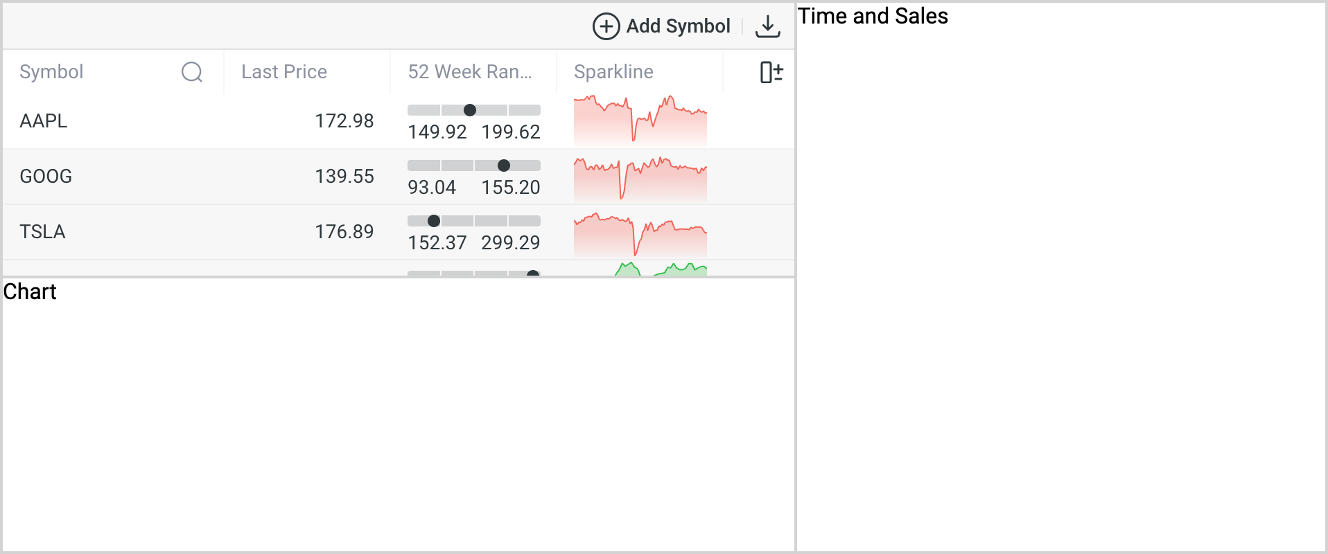
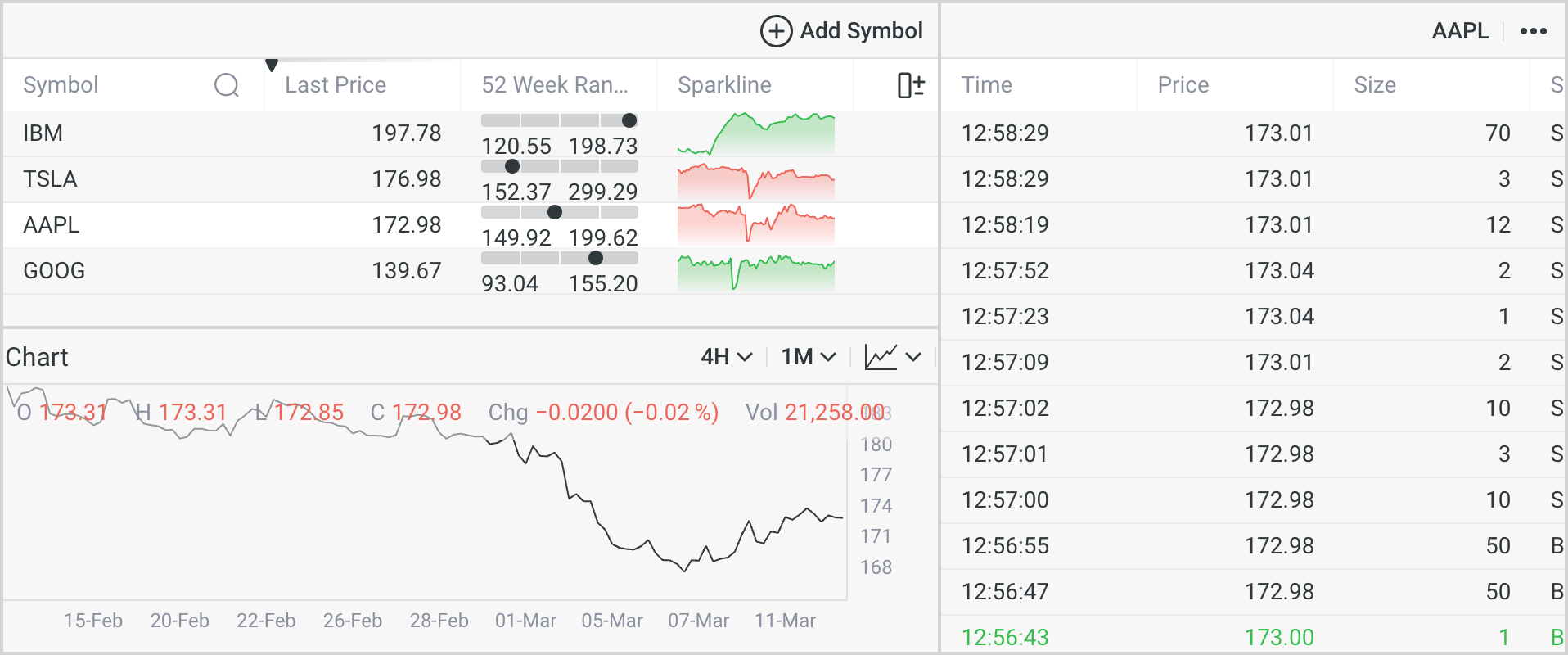
As a result, we'll end up seeing something like this:
Connecting widgets
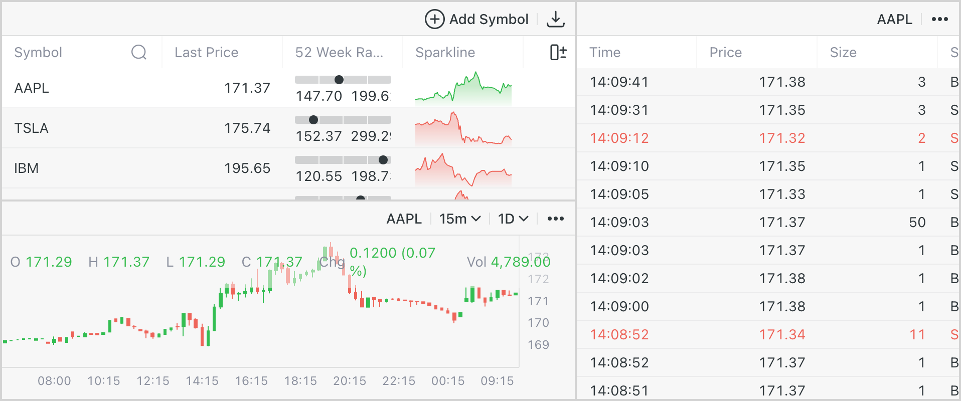
Our widgets appear to be functioning properly, but what if we need to establish connections between them? Let's link the selected symbol in the WatchList to both the TimeAndSales and SimpleChart widgets.
/* ... */

const handleSymbolChange = (symbol) => {
  SimpleChartWidget.updateState({ symbol })
  TimeAndSalesWidget.updateState({ symbol })
}

WatchListWidget.addStateListener('selectedSymbol', handleSymbolChange)
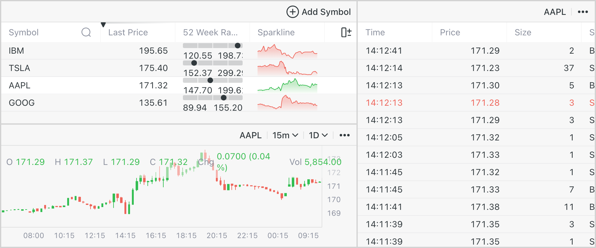
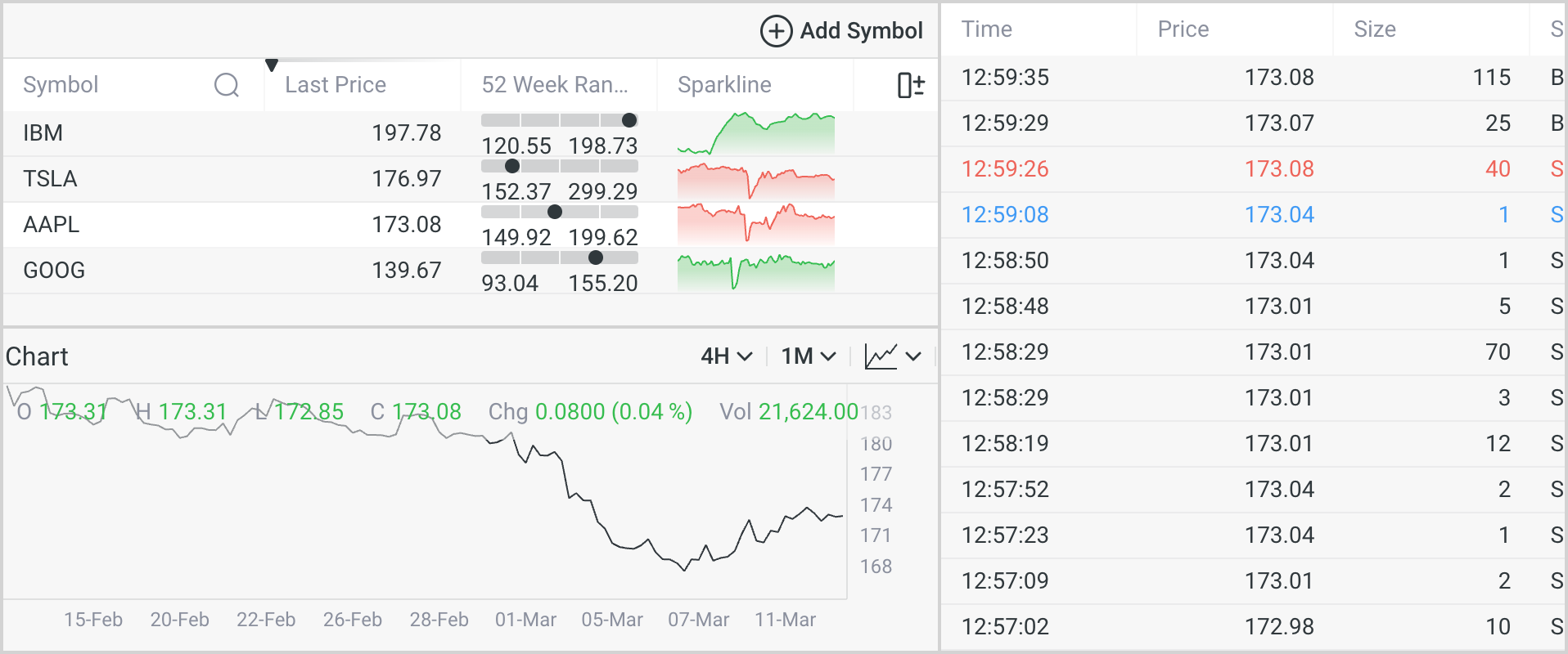
Now, when we select a new symbol in the WatchList, it is automatically selected in in all widgets.
Configuration
Now let's configure different widget parameters to see their capabilities.
WatchList
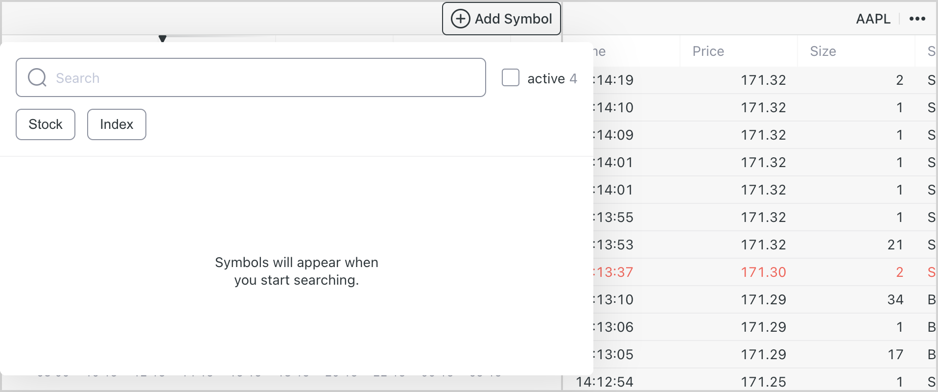
Let's change some settings for WatchList:
- Limit instrument selection to stocks and indices
- Disable data export functionality
- Set default sorting by last price
We can implement these changes as follows:
/* ... */


const WatchListWidget = newWatchListWidget({
  element: document.getElementById('watch-list'),
  providers: dataProviders,
  config: {
    symbolSearchTypes: ['STOCK', 'INDEX'],
    dataExportEnabled: false,
  }
  state: {
    symbols: initialSymbols,
    sort: {
      property: 'lastPrice',
      direction: 'descending',
    },

  },
  theme: 'light',
})

/* ... */
And now it appears as follows:
SimpleChart
Now, let's configure our SimpleChart to adjust the following settings:
- Hide symbol search functionality
- Disable data export feature
- Modify aggregation period and range
- Modify series type
- Add a custom header with the "Chart" label
We can implement these changes as follows:
/* ... */

const SimpleChartWidget = newSimpleChartWidget({
  element: document.getElementById('simple-chart'),
  providers: dataProviders,
  config: {
    symbolSearchViewMode: 'hidden',
    dataExportEnabled: false,
  }
  state: {
    symbol: initialSymbols[0],
    aggregationPeriod: '4H',
    range: '1M',
    seriesType: 'line',
  },
  theme: 'light',
})

const header = document.createElement('div')
header.style.placeContent = 'center'
header.textContent = 'Chart'

SimpleChartWidget.setSlot('header', header)
As a result of these changes, all of the modifications will be instantly reflected:
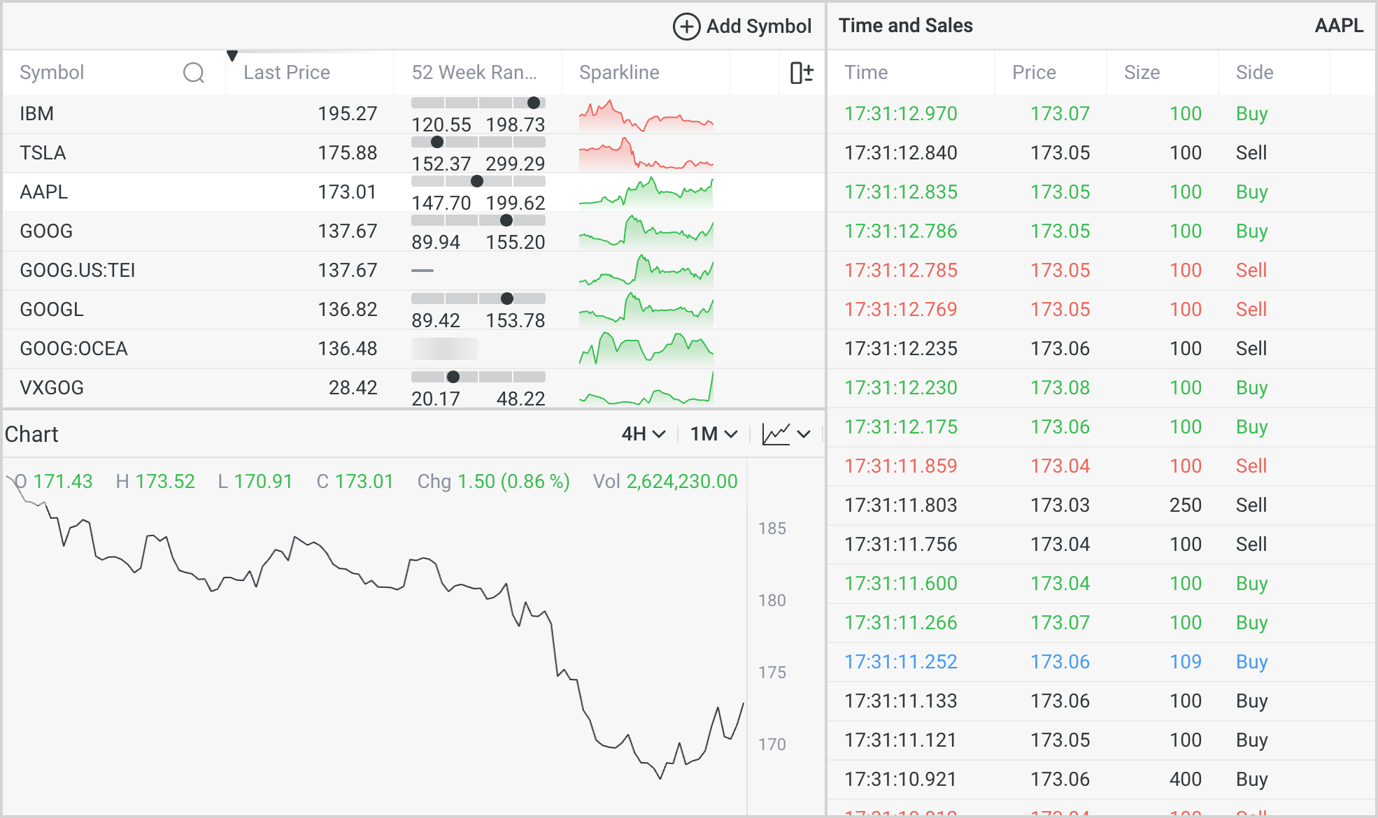
TimeAndSales
TimeAndSales is our final widget, and let's make some more significant modifications:
- Hide all toolbar controls to remove the toolbar
- Disable all table functions including resize, reorder, select, filter, and sort
- Set fixed columns with a fixed size
We can implement these changes as follows:
/* ... */

const TimeAndSalesWidget = newTimeAndSalesWidget({
  element: document.getElementById('time-and-sales'),
  providers: dataProviders,
  config: {
    symbolSearchViewMode: 'hidden',
    timeFormatSelectorViewMode: 'hidden',
    tradeTypeSelectorViewMode: 'hidden',
    columnSelectMenuEnabled: false,
    sortable: false,
    filterable: false,
    resizable: false,
    reorderable: false,
  }
  state: {
    symbol: initialSymbols[0],
    columns: ['time', 'price', 'size', 'side'],
    columnSizes: {
      time: 120,
      price: 80,
      size: 80,
      side: 80,
    },
    timeFormat: 'time-with-milliseconds',
  },
  theme: 'light',
})
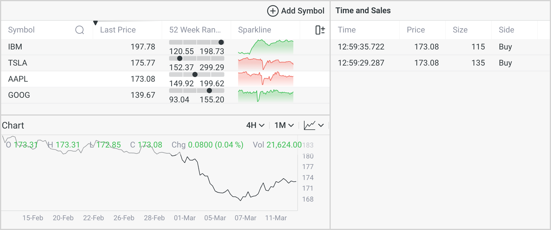
As a result of these changes, all of the modifications will be instantly reflected:
But let's take it a step further and incorporate our own custom header. To achieve this, we'll need to adjust our layout:
<!DOCTYPE html>
<html lang="en">
  <!-- ... -->
  <body>
    <div id="app">
      <section id="watch-list">WatchList</section>
      <section id="time-and-sales">
        <div class="widget-header">
          <span>Time and Sales</span>
          <span class="widget-symbol"></span>
        </div>
        <div class="widget-content"></div>
      </section>
      <section id="simple-chart">Chart</section>
    </div>
  </body>
</html>
After that, we'll need to make additional style adjustments to ensure the header maintains a consistent appearance:
#time-and-sales {
  display: grid;
  grid-template-rows: max-content minmax(0, 1fr);
  grid-template-columns: minmax(0, 1fr);
  grid-column: 2 / 3;
  grid-row: 1 / 3;
}
.widget-header {
  display: flex;
  align-items: center;
  justify-content: space-between;
  height: 33px;
  padding: 0 4px;
  background-color: rgb(247, 247, 247);
  border-bottom: solid 1px rgba(49, 56, 61, 0.12);
  font-size: 14px;
  line-height: 18px;
  font-weight: 500;
  color: rgb(49, 56, 61);
}
Additionally, we'll need to update the insertion method for our widget within the new layout in main.js:
/* ... */
const WatchListWidget = newWatchListWidget({
  element: document.getElementById('watch-list'),
  providers: dataProviders,
  state: {
    symbols: initialSymbols,
  },
  theme: 'light',
})

const widgetSymbolContainer = document.querySelector('#time-and-sales .widget-content')

const TimeAndSalesWidget = newTimeAndSalesWidget({
  element: widgetSymbolContainer,
  providers: dataProviders,
  state: {
    symbol: initialSymbols[0],
  },
  theme: 'light',
})

widgetSymbolContainer.innerText = TimeAndSalesWidget.getState().symbol

const SimpleChartWidget = newSimpleChartWidget({
  element: document.getElementById('simple-chart'),
  providers: dataProviders,
  state: {
    symbol: initialSymbols[0],
  },
  theme: 'light',
})
/* ... */
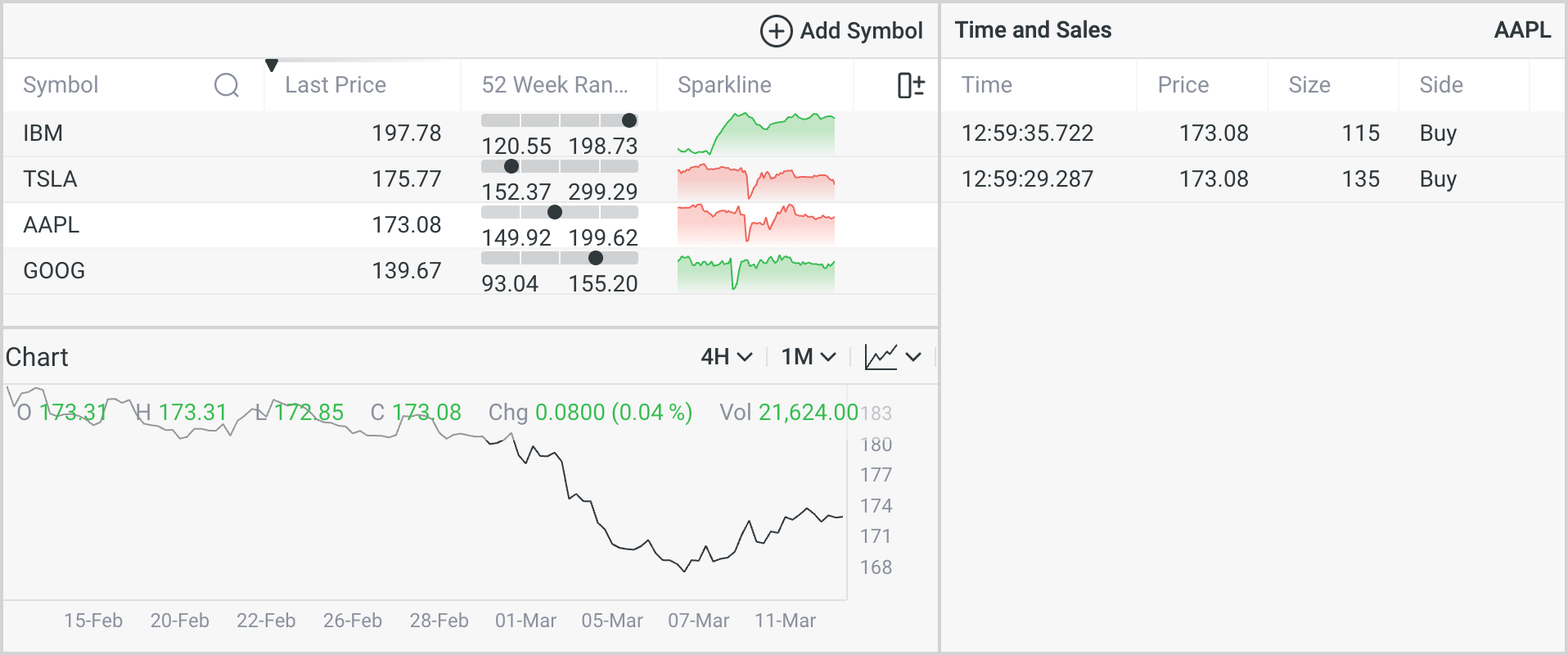
Now our widget should appear as follows:
We've incorporated a span element with the class name widget-symbol. This was done to introduce supplementary logic.
Now, let's assign our present symbol from the TimeAndSales to this span element:
/* ... */
TimeAndSalesWidget.addStateListener('symbol', (symbol) => {
  document.querySelector('#time-and-sales .widget-symbol').innerText = symbol
})
That's it. Now, we can effortlessly observe the current symbol in the widget header, which will be synchronized automatically.
Conclusion
Throughout this tutorial, we've navigated the complete cycle of developing an application. We've integrated three widgets and configured them differently, using the extensive capabilities offered by the widget API. You have the ability to make widgets configurable by the user or keep them simple for display purposes only.
Additionally, in the course of the tutorial, we've configured a proxy server to hide all credentials, thus avoiding the risk of data leakage.
It's important to note that this proxy configuration is intended solely for development purposes. For the deployment stage, you'll need to set up the same proxy using nginx or another tool.
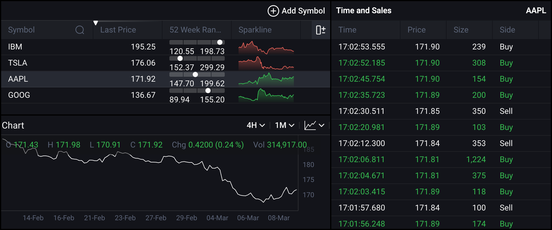
Theme (Bonus)
In this tutorial, we've avoided setting a theme for our widgets and have provided a light theme as the default.
For detailed guidance on styling, refer to the How-to-guides section. However, let's make a minor adjustment to our
code to change the hardcoded theme to a theme based on the default theme in the operating system.
First, we need to introduce a theme variable:
const theme = window.matchMedia?.('(prefers-color-scheme: dark)').matches ? 'dark' : 'light'
document.getElementById('app').classList.add(theme)
Then, provide this variable to all widgets as follows:
WatchListWidget.setTheme(theme)
Afterwards, we'll need to refine the styles slightly to enhance the appearance of the dark theme, like this:
#app.dark {
  background: #000;

  .widget-header {
    background-color: rgb(19, 20, 25);
    color: rgb(250, 250, 250);
  }
}
And as a result, we now have the same application, but with a dark theme: